Points at a specific data row with an arrow and label. The callout
consists of a text label inside a rounded box, connected to the target
data point by a line segment with an arrowhead. Built on top of
ggpp::geom_label_s().
Arguments
- data
A data frame. Should be the same data frame used in the ggplot, or a subset of it. Must contain the columns mapped to x and y in the plot's
aes(). Note: the automatic nudge heuristic estimates label offset from the data ranges, but it guesses which columns are x and y. For data frames with many numeric columns, passing a two-column subset (e.g.,data[, c("date", "sales")]) or settingnudgeexplicitly gives more reliable placement.- where
<tidy-eval> A filtering expression that identifies exactly one row of
data. For example,year == 2020orquarter == "Q4" & region == "West". An error is thrown if the expression matches zero or more than one row.- label
A single character string for the annotation text.
- position
Where to place the label relative to the data point. One of
"top-right"(default),"top-left","bottom-right", or"bottom-left".- nudge
Optional numeric vector of length 2 (
c(x, y)) giving explicit nudge amounts in data units. Overrides the automatic nudge heuristic, which estimates 5% of the x and y data ranges. The heuristic works well whendatacontains only the plotted columns; ifdatahas many numeric columns (like ggplot2::economics), passing a two-column subset or settingnudgeexplicitly avoids the heuristic picking the wrong column's range.- ...
Additional arguments passed to
ggpp::geom_label_s(). Use to override defaults likesize,colour,fill,alpha, orarrow.
See also
annotate_change() to label the delta between two data points.
Examples
library(ggplot2)
p <- ggplot(economics, aes(x = date, y = unemploy)) +
geom_line()
# Basic callout
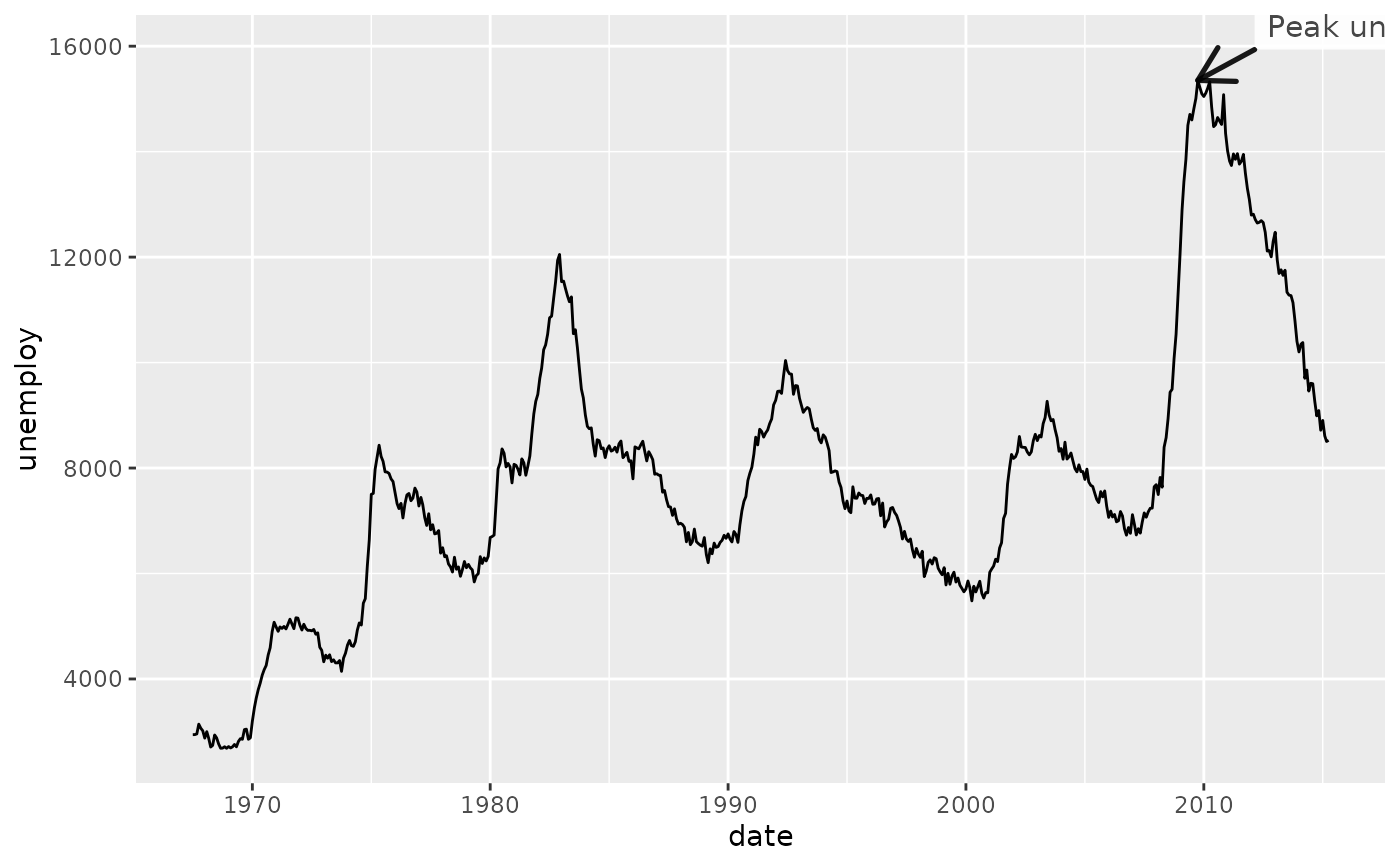
p + annotate_callout(
economics,
where = date == as.Date("2009-10-01"),
label = "Peak unemployment",
position = "top-right"
)
 # With explicit nudge (useful when data has many numeric columns)
p + annotate_callout(
economics,
where = date == as.Date("2009-10-01"),
label = "Peak unemployment",
nudge = c(365, 500)
)
# With explicit nudge (useful when data has many numeric columns)
p + annotate_callout(
economics,
where = date == as.Date("2009-10-01"),
label = "Peak unemployment",
nudge = c(365, 500)
)
 # Customize label appearance via ... (larger text, yellow background)
p + annotate_callout(
economics,
where = date == as.Date("2009-10-01"),
label = "Peak unemployment",
nudge = c(365, 500),
size = 5, fill = "lightyellow"
)
# Customize label appearance via ... (larger text, yellow background)
p + annotate_callout(
economics,
where = date == as.Date("2009-10-01"),
label = "Peak unemployment",
nudge = c(365, 500),
size = 5, fill = "lightyellow"
)
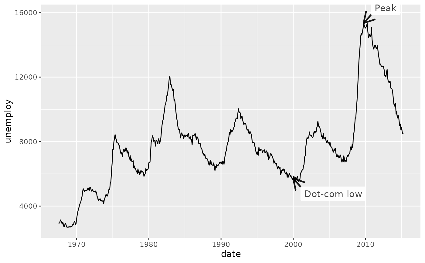
 # Mark both the peak and the trough on the same chart
p +
annotate_callout(
economics,
where = date == as.Date("2009-10-01"),
label = "Peak",
nudge = c(365, 500)
) +
annotate_callout(
economics,
where = date == as.Date("2000-01-01"),
label = "Dot-com low",
position = "bottom-right",
nudge = c(365, 500)
)
# Mark both the peak and the trough on the same chart
p +
annotate_callout(
economics,
where = date == as.Date("2009-10-01"),
label = "Peak",
nudge = c(365, 500)
) +
annotate_callout(
economics,
where = date == as.Date("2000-01-01"),
label = "Dot-com low",
position = "bottom-right",
nudge = c(365, 500)
)